
Below you can find links to the collection of student visualizations (and accompanying analyses) for the undergraduate course Mind Games in Film: Analyzing Narrative Complexity in Transnational Cinema, NYU, Spring 2018. UPDATE: Visualizations from Fall 2023’s Mind Games seminar have been added at the bottom of this page, as well as final multimedia presentations/projects that also engaged in multimodal and multisensory visualizations (including smell & taste).
Fall 2018 montage [scroll down for details and more info]:


Fall 2020 montage [scroll down for details and more info]:


ASSIGNMENT DESCRIPTION AND OBJECTIVES:
>> Visualization assignment. This is an experimental assignment that will challenge you to think outside the box and produce new modes of interpretation that go beyond verbal analysis. For the purposes of this course, visualization includes: an illustration, a chart, a diagram (e.g. in the form of a 3D prezi, an infographic, or Venn diagram), a sketch, a short video essay, a photoshopped movie poster, an annotated image/video (see for instance ThingLink), and other non-linguistically oriented schemas. You will produce your own visualization or modify/add to an existing one, focusing on one (or more) of the feature-length films we have watched in class. Examples will be provided online and in class; see also Nick Redfern’s article (Week 2) and Elliot Panek’s article (Week 9), as well as the optional readings posted online. Your visualization must be accompanied by a 1 (or more) paragraph analysis that offers insights into your creative process, and explains how your visualization helps illuminate certain aspects of the film [take a look at some of the examples I provided below – book excerpts and videoessays]. Your visualization can be on the same film(s) as your FR or CA, and you can turn it in at the same time as your FR or CA. For visualizations, you do not need to turn them in a week after your chosen film has been discussed in class (unlike FR/CA), so you can basically take longer to complete this assignment if you would like to submit the other 2 assignments first. Share your visualization and the 1 (or more) paragraph analysis on your blog, on a new page titled “Visualization,” and also share the link on the Discussion page. The objective of this “critical making” assignment is to propose different ways of approaching moving image analysis, and to prime you for your multimedia presentation (an adaptation of your final paper) and/or final project. Bonus points will be given for more elaborate and time-consuming visualizations, assessed on a case by case basis.
**For students who do not feel inspired to create their own visualizations: you can focus on a visualization from the film itself (e.g. a screenshot from the film that resembles/mirrors the film’s own structure), and analyze it (or modify/photoshop it) in a longer analytical passage (approx. 1.5-2 pages), or annotate it in-depth [see ThingLink examples below]. Examples of films providing their own visualizations: the chart in TimeCrimes, the shots of the obstructed nature views in Rashomon, the mise-en-abyme shots in Oldboy, the interconnected origami in Upstream Color, the calendar in Premonition, the chart in films like Memento and The Almanac Project, the Cloud Gate reflection in Source Code, and so on… In your visualization analysis, you can focus on how your chosen screenshot/object mimics and/or deviates from the film’s overall organizational/conceptual schemata, etc.
* RECOMMENDED READING ON MULTIMEDIA/DIGITAL SCHOLARSHIP (for your final project/ multimedia presentation/ visualization assignment): AndersonMcPherson_EngagingDigitalScholarship_Profession2011
MORE EXAMPLES OF VISUALIZATIONS (in additions to those we discussed in class & in assigned readings – check the Links//Resources page for more):
- Examples from Digital Humanities visualizations (computational, mathematical/forensic, artistic etc)
- Examples published in Willemsen and Kiss’ Impossible Puzzle Films book:
– Inception: Inception_Visualizations2_PuzzleFilms – – Syriana (“clogged sink narrative” = too many plots and subplots): Syriana_CloggedSinkNarrative_Visualizations1_PuzzleFilms – Triangle: 1. Triangle_Visualizations3_PuzzleFilms & 2. Triangle2_Visualizations4_PuzzleFilms [see also full excerpts for Triangle and TimeCrimes, with analyses of the visualizations/diagrams/symbols, included in the Readings page under the weeks each film’s specific readings are assigned] - Mind-Blowing Inception infographics
- 10 Infographics That Make Sense of Confusing Movies
- Article on TimeCrimes, with visualizations
- Ghislotti’s article/book chapter on Memento –> see also: film timeline & infographics
- Run Lola Run sound analysis, by graphic designer Stephanie Audette
- Primer timeline
- StoryCurves – many films covered
- Triangle explained – videoessay (includes some visualizations, e.g. around 13:52)
- Oldboy: Resurrecting Greek Tragedy – videoessay (includes visualizations, e.g. 7:24+) – Below: using German novelist/playright Gustav Freytag’s triangle to analyze Oldboy‘s structure; according to Freytag’s triangle, a drama is divided into five parts/acts [a dramatic arc]: exposition, rising action, climax, falling action, and dénouement. Relating Freytag’s triangle to Aristotle’s poetics of classical drama and Greek tragedy.
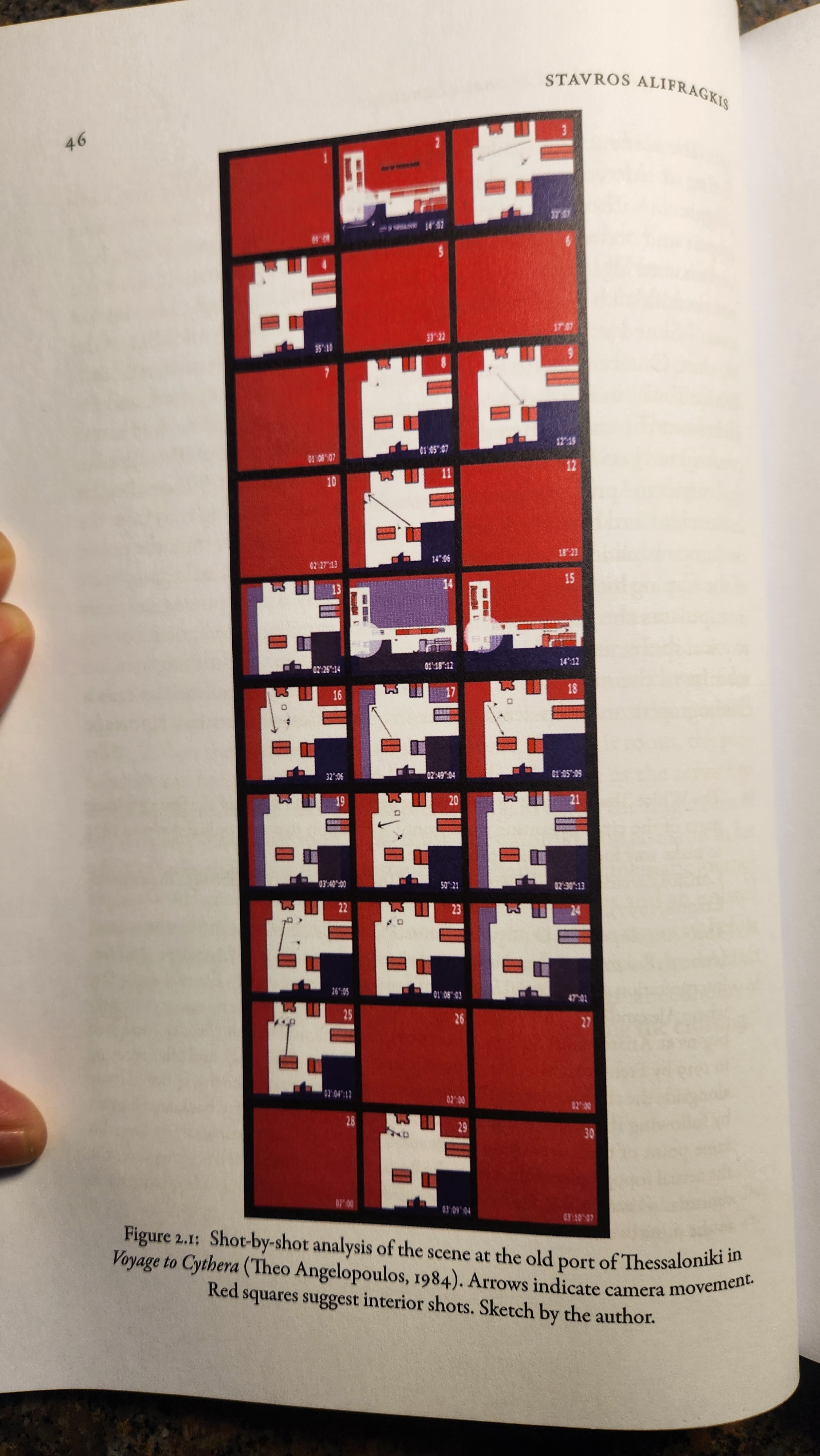 Stavros Alifragkis’s visualization from his essay, “Constructing the Urban Cinematic Landscape: Theo Angelopoulos’s Thessaloniki,” published in Contemporary Greek Film Cultures from 1990 to the Present.
-
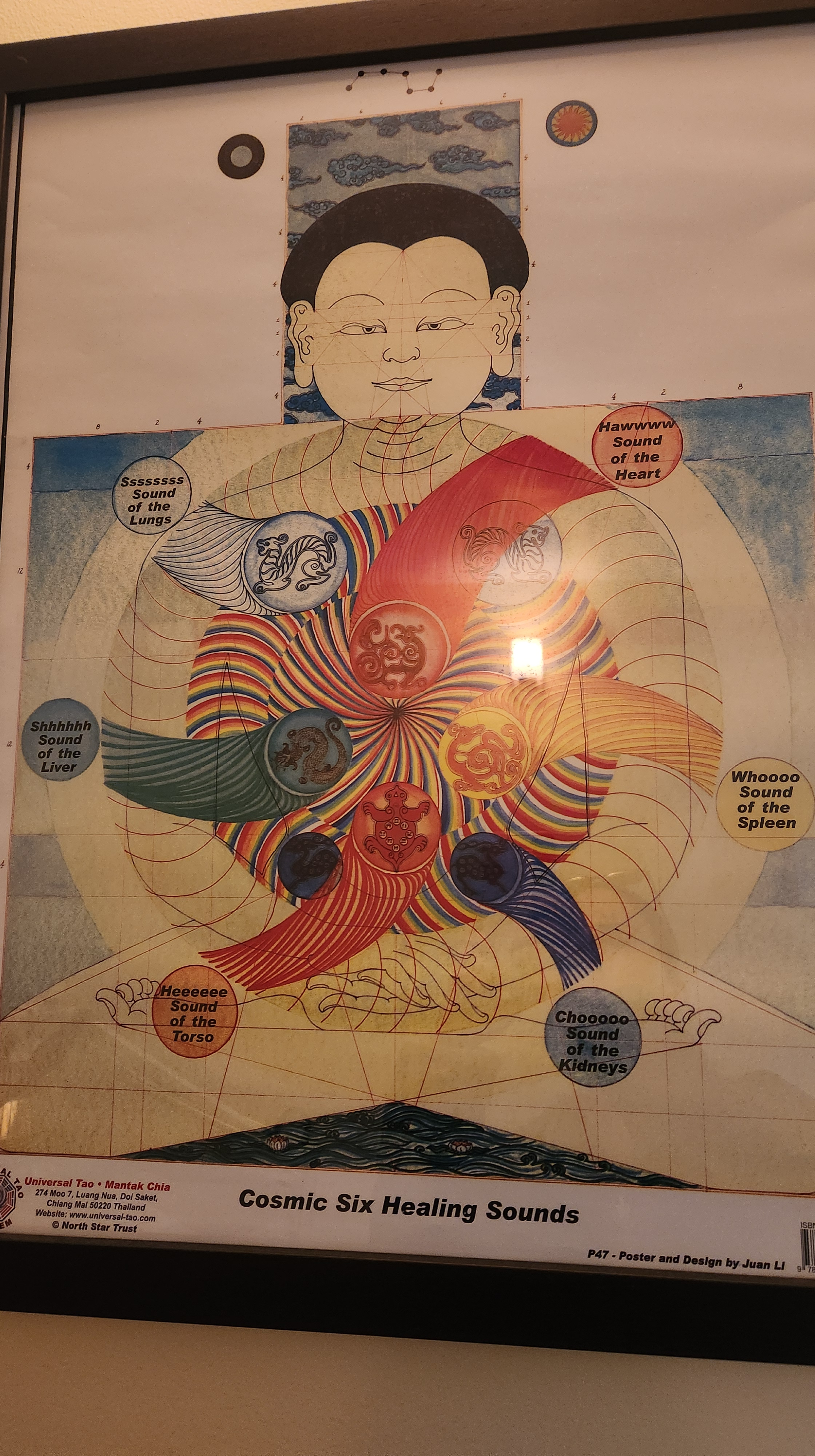
Chinese acupuncture sound healing visualization (below).
- Oldboy – the film visualizing its own structure: mise-en-abyme [“to place in the abyss” – frame-within-a-frame (formally), reality-within-reality, dream-within-a-dream, doubling/layering/infinite mediation]. If you choose to use a screenshot from the film instead of creating your own visualization, then you can provide annotations for that screenshot (see for instance my annotations of a screenshot from Cinema Paradiso, using ThingLink – see more on ThingLink below, and email me for a free account]. You can also use ThingLink to annotate your own visualization, instead of writing a traditionally linear 1-paragraph analysis. You can then embed your ThingLink into your blog post (use a new page, titled visualization). You can use this tool for more elaborate final projects too (see Da Ye’s Korean mindgames-themed example below).
— List of culinary visualizations (thanks to Jojo Karlin from NYU DH):
- Social Explorer makes “Data Snacks” which are quick data stories generated from their platform.
- You can use snacks to create visualizations like the Data Cuisine project (an oldie, but a tasty looking one)
- Or the recipes are somehow used as data like the CondeNast FoodGraph project
- Even Google has put together a fun food datavis: Rhythm of Food.
Examples from past semesters & other courses:
- Visualization of the timelines/loops in The Incident/El Incidente
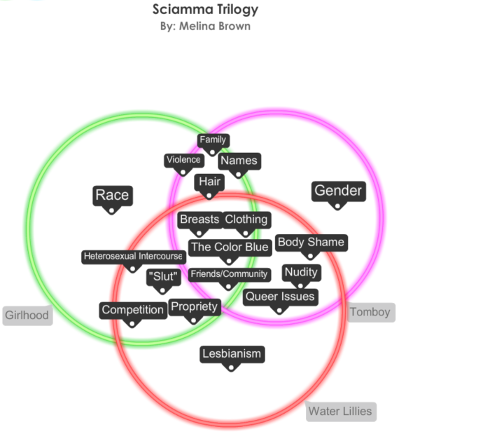
- Venn diagram illustrating the overlapping themes in Céline Sciamma’s youth trilogy films (you can modify the Venn diagram according to the requirements for this assignment).
 Final paper – multimedia adaptation projects:
 - Da Ye Kim, “Reconceptualizing Multiple Dichotomies in Cinema” – Interactive, interconnected annotated images made with ThingLink.
- Ina Cajulis, Multiple Draft Narratives, Multiple Subjectivities & Source Code [ThingLink annotated image]
- Eshan Parikh, Nolan’s Mind-Game films [prezi]
- RESOURCES: My page of digital tools, if you would like to try something more elaborate (keep in mind that you can also produce something complex with just pen and paper, or powerpoint slides, or a 3D prezi, etc). If you have an idea but need suggestions for tools/platforms to use, let me know. You can also do a search for free tools online (for instance, there are several easy to use Infographics tools).
- ThingLink is a useful tool for creating annotated images and video (including 360 images) for close film analysis. Contact me for free access.
STUDENT VISUALIZATIONS:
FALL 2018
- Austin Phares: Eternal Sunshine of the Spotless Mind – “mind” map
- Brittany Santiago: Cube video game visualization
- Soyoung (Liz) Yun: Rashomon, Oldboy, Mulholland Dr. visualizations
- Ember Hua: Source Code and Mulholland Dr. mobius strip
- Hyeseung Kim: Meshes of the Afternoon visualization/movie poster
- Kate Anderson-Song: Repulsion interactive composite apartment map/folder
- Kristi Shanxhaku: Mulholland Dr. sketch visualization
- Paola Malo: Triangle visualization
- Soo An Kang: Repulsion visualization
- Suzie Kang: Time/ TimeCrimes visualization
- Yousra Amin: Babel visualization
- Antonio Pinheiro: Oldboy visual analysis
FALL 2020 VISUALIZATIONS & FINAL MULTIMEDIA PRESENTATIONS/ PROJECTS:
- Faith Mallawong: Eternal Sunshine visualization (cake) | Final: Memento & Shutter Island (collage+video)
- Isabella Armus: Mulholland Dr. viz (slider/images) | Final: “Chocolate Mousse, and Other Venues of Sensory Exploitation and Gendered Subjectivity – Rosemary’s Baby & The Invisible Man“ (cooking/senses)
- Jack DeGhetto: Cubing Cube (analog/handmade/digital) | Final: Nymphomaniac: Good Provocation (video essay)
- Lefan Lin: El Incidente/The Incident viz (mind map/collage) | Final: 2046 & Eternal Sunshine (prezi)
- Jake Laven: The Incident viz (sketch/remix) | Final: Mind Games & Sci-Fi viz (infographic/historiography)
- Jason Zuriff: Mulholland Dr. viz (video essay) | Final: “One Way Mirror” – Egoyan (video essay)
- Joely Garcia: TimeCrimes viz (montage/photoshop) | Final: “The Truman Show/ Mother Nature’s Vengeance” (video essay/remix/montage)
- Paige Nelligan: Eternal Sunshine viz (collage/photoshop) |Final: “Who Are You? Identity Confusion in Cure and Perfect Blue“ (powerpoint/slides)
- Seraphim Arlievsky: Oldboy viz (photos/curation remix) | Final: “Soviet Collective Identity through Film” (slides/powerpoint/clips)
- Zak Goodwin: Eternal Sunshine viz | Final: Identity Collapse in Bergman, Lynch, and Altman (images/ collage/montage)
- Emily Hime: Eternal Sunshine viz (sketch/drawing) | Final: Repulsion visualization (collage/remix)
FALL 2023 VISUALIZATIONS & FINAL MULTIMEDIA PRESENTATIONS/PROJECTS:
- Ash Zhou: Mulholland Drive visualization (3D sign) & Final: Interactive film posters
- Ben Raimondo: mental poster & final slides, “Eye of the Beholder: Visual Communication, Time, and Memory in Arrival and Decision to Leave”
- Chris Zhou: AI-generated visualizations (with human intervention) & Final: “Cinema’s Power to Explore and Represent Psychological Trauma and Identity Crisis” blog post/slides *
- Christian Baez: Mulholland Drive diagram & Final: On animated/anime Japanese mind game films (slides)
- Edgar De Dios: Cronocrimenes photoshop & Final: Screenplay
- Erin Hines: Incident-inspired recycled trash molecular modeling & Final: slides mind-games-final-paper-presentation-1
- Felice Fischer: Oldboy knitted tongue visualization & Final: “A Character Study through the Five Senses: Kirigoe Mima and Song Seo-Rae” *
- Jake Sweeney: Mulholland Drive/Lynch-inspired video meme-collage & Final: Slides
- John Paul T.Faza: Source Code timeloop video visualization & Final: “Cinematic Mind Games: How Narrative Complexity and Ambiguity Catalyze Participatory Culture” video essay *
- Nathan Hughes: Cube photographic visualization & Final: “Jordan Peele’s Mind Game Films” slides & blog
- Sofia Echandy: timecapsule visualization inspired by several films & Final: “The Body Destroyed” zine collage *
- Xulun Luo: The Incident visualization (including code) & Final: “The Artificial Intelligence of Mind Game Cinema” *
- Zohar Peretz: Source Code visualization soundtrack & Final: *
